Sunday, April 16, 2017

Post Modernism

The Wall House in the Netherland by American architect John Hejduk really caught my attention. Made with several materials.. concrete, steel, wood, and stucco the structure is one of a kind. Its unique shape, design and colors reminded me of something fictional like Alice in Wonderland or Charley and the Chocolate factory themes.


John Hejduk was a designer that made great use of the grid system as well as geometric shapes. He has a cubist type and would often study the psychological elements when it came to his designs. The space was originally designed for Ed Bye in 1973 but due to fear of costs it was put on hold and later funded by the development company Wilma. The house was not actually constructed until 2000 after the death of Hejduk. The space is 2,500 square feet and has a huge wall as its center piece. Surrounding the wall are four organic living spaces with a long passage way to connect them.

Current Applications:


Sketch of a skyscraper that resembles the organic shapes of The Wall House II. 


Extra Credit: https://www.youtube.com/watch?v=chEfhs-kEXQ
Here is a short clip of Hajduk, a powerful message about architecture.

Responses:
Courtney- The quote you included was very moving. I also find his motivation for his work very moving.
Megan- I like how you included the origin of recycling. It is crazy to think that the practice is so young.


Sunday, April 9, 2017

Memphis Movement

I was very inspired by the Memphis movement because you still see a lot of this style being implemented in different art forms from the time that it was created to present day. The style that I like to describe as "loud" is very colorful, fun and most definitely odd. The Memphis style was created by The Memphis Group, several Italian architects from Milan. The founder Ettore Sottsass founded the group on 1981 and chose the name Memphis from the Bob Dylan song "Stuck Inside of Mobile with the Memphis Blues Again" which had been playing on repeat at the meeting the group had been established at. The group was inspired by Art Deco, Pop Art and Kitsch styles and designed furniture, fabrics and other art pieces from the year they started up until 1987. Their style was very colorful and used a lot of asymmetrical shapes and designs. 


"Perhaps most misunderstood and openly loathed, however, was Memphis, a school of design that was a riot of color and materials that often overwhelmed a piece's original intent, a shotgun wedding between Bauhaus and Fisher-Price."

Designers today are still using these this once hated design style. The abstract shapes, dizzying graphics and contrasting colors are making a headway in the fashion industry.
American Apparel  

Chair by Hay with textile cover designed by Memphis Group member Nathalie Du Pasquier

Nathalie Du Pasquier's prints on bags displayed at the Wrong for Hay Mini Market in Milan

Extra Credit: https://www.youtube.com/watch?v=8TYLjUb2VHY
American Apparel has collaborated with artist Nathalie Du Pasquier to create a collection of clothing using new prints inspired by Du Pasquier's

Respones: 
Somag- I liked how you focused your entry on Charles and Ray Eames. Their work is some of my favorite.
Demi- The image of the Eames lounge chair inspired shoe was very interesting. Good find!


Sunday, April 2, 2017

Modernism in America Part 2

Frank Lloyd Wright was definitly the most famous architect of this time and produced many historical pieces. The piece that I am drawn to the most is La Miniature, The Millard House in Pasadena, California. Made of concrete block cast with decorative patterned faces this was his most famous houses during the 20s and 30s. The house is made up surfaces that highlight repeated patterns. The residential property features an acre of gardens, 4 bedrooms, 4 baths, 2 kitchens, living space, formal dining room and semi attached garages. The house was built in 1923 and 1924 after the completion of the Hollyhock House in Hollywood and the Imperial House in Japan.

Wright at the time was very driven to design something that was much different than anything that he had done before. He felt that he had been labeled as "the Prairie house designer" and wanted to remind people that he was capable of producing unique works that were stylized to stand alone.  
 It is noted in an autobiography of his that he was drawn to designing with concrete blocks because they were the cheapest and ugliest thing in the world. He took this as a challenge and stated he wanted to see, "what could be done with that gutter-rat. The blocks were made in wooden molds that had the patterns along the walls of the molds. Using the technique of reinforced blocks cost $17,000 and Wright had only been given a $10,000 budget.


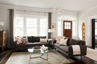
Current Day Applications of Modernism


Extra Credit: 
Here is a video slide show of the interiors of the house that was created to help sell it when it was on the market in November 2014. 
https://www.youtube.com/watch?v=5VVAYbB7XT4

Responses: 
Alexandra- Thanks for sharing your experience about visiting the Miller House. Its layout and design look incredible. 

Bailey- I liked how you discussed how designers came to America and the transition between countries.